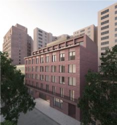
Changes made to controversial Jane Street development included the replacement of glass and cast stone with red brick and concrete panels. On January 17, 2017, the Landmarks Preservation Commission considered a revised proposal to replace a 1921 garage building at 11 Jane Street in the Greenwich Village Historic District with a new residential structure. The applicants proposed to replace the two-story garage with a building rising to five stories at the streetwall, with a setback penthouse floor. Two multi-story single-family “maisonettes” with their own entrances would be incorporated into the revised plan, as well as apartments and a garage.
Over two meetings on June 21 and July 16, 2016, the Commission held a public hearing on the initial application. The initial plan was strenuously opposed by local residents and their elected officials, including Deborah Glick, Brad Hoylman and Corey Johnson, as well as Manhattan Community Board 2 for its design and scale. The majority of commissioners found demolition of the garage appropriate, but objected to the use of cast stone on the proposed building’s facade, as well as the facade’s design, and expressed concerns about its height.
At the January 17th meeting, Higgins Quasebarth Consultant Ward Dennis characterized the revised plan as a “softer approach,” influenced by masonry apartment buildings found in the district. Dennis again emphasized that the 1969 district designation report called the existing garage, as well as another nearby garage, as “intruders on a residential street,” and said such buildings were expected to be replaced over time at designation.
Architect David Chipperfield presented the proposal. The facade above the first floor would be clad in panels composed of hand-made red brick, leading to much more textured face, with a materiality recalling other Greenwich Village masonry structures. The ratio of masonry to glazing would be much greater, with the faced window recalling historic punched openings. Chipperfield said the changes would give the building more of a “domestic feel.” The ground floor would be fast in cast concrete panels of the same color as the brick.
The building would have a central entrance for access to the apartments, with an adjoining “discreet” garage entrance. The “maisonettes” would possess their own entrances, set in from the streetwall behind a gate.
A series of black metal balconies at the second floor would further delineate the base from upper stories.
The total height of the proposal was also lowered by nine-and-a-half feet by removing a rooftop bulkhead from the plan. Chipperfield said the proposal’s volume was “quite sensible” for the site, with taller buildings behind the property to the north, and the proposal cornice aligning with a nearby building on the block.
The penthouse, set 15 feet back from the front facade, would not be visible to pedestrians standing directly in front of the building, but would be partially visible from other Jane Street vantages.

Rendering of 11 Jane Street. Image Credit: LPC.
Chair Meenakshi Srinivasan stated the Commission had received communications numbering in the hundreds from area residents and organizations opposing the approval of the revised plan.
Commissioner Michael Devonshire reiterated his conviction that the garage was worthy of protection, arguing that there had been a shift in the perception of garages and industrial buildings in preservation thought in the 48 years since the designation report was issued.
Commissioner Diane Chapin said that the materials and massing were generally appropriate, but still expressed concern about the design, especially the windows, which she found too vertical. Commissioner Jeanne Lutfy praised the design for moving to address community concerns, and successfully adapting contemporary design to a historic district, but concurred that fenestration was still inappropriate. Commissioner Michael Goldblum said sliding windows were generally associated with non-residential buildings and solid or hung windows would be preferable. He also found the facade excessively monochromatic, but said the proposal fell within parameters of what Landmarks had found appropriate in the past. Commissioner Devonshire said that monochromatic color scheme “screams Marriott.”
Commissioner Wellington Chen said the revisions were a step in the right direction, but the plan was still too monolithic, and gave the impression of a hotel. Chen suggested the designers articulate the different interior use on the exterior.
Srinivasan found the proposal generally appropriate, commending the improved materials and color, but said she would prefer to see the penthouse lowered or further set back. Commissioner John Gustafsson also wished to see the visibility of the penthouse reduced.
Without a majority of Commissioners willing to vote for approval, Srinivasan asked the applicants to reconsider the windows, consider ways to vary facade color, and look at ways the building’s base could be improved, and present a third iteration of the proposal to the Commission at a later date.
LPC: 11 Jane Street, Manhattan (19-5552) (Jan. 17, 2017) (Architect: David Chipperfield Architects).
Jesse Denno (Jesse is a full-time staff writer at the Center for NYC Law).


